This is what 2 hours of boredom on a slow Sunday afternoon made me do. Behold!!! THE DANCEFORMER!!
Challenge 3 : Time Machine | Research, Print Advertising

This gallery contains 4 photos.
Task – Select a print ad from before 1980, then redesign it. Moral : This is one assignment that just makes you forget the world. There are too good old ads our there and its so much fun just to find them. Try this one blog for sure. Choose a product you haven’t worked on… Read more.
Challenge 2 : Easy as ABC | Photography, Type
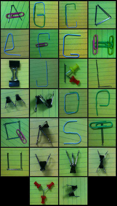
Task : Design a typeface composed from elements in the world around you.
Moral : First of all, there are a lot, and i mean ALOT of things around. This one is surely based on how keen your observation is and above all how you put it to use. Also more mobile you are, better will be the results [check this one for yourselves] . It’s good to keep in mind the consistency so as the characters seem part of the same typeface in the end. At another level it seems to check as to how in-depth you seem to know how typefaces look. At times the characters that come out are not exactly conventional alphabets. Overall its a fun exercise.
Time : 120 mins
Output :
I choose my stationary pins as the element. For some reason i wanted to do this with the yellow ruled paper background. Some very unconventional motifs emerged. For some reason i like the ‘R’, i guess because i was able to make this with one binder clip; on the contrary i like ‘W’ because it used two, one smaller than the other.
The exercise didn’t really end. Some time was left so i started making weird symbols out of the same stuff. Also i figured some more ways to make alphabets better.
Personally i tried getting solutions as different as possible and i think that should be the aim.

